
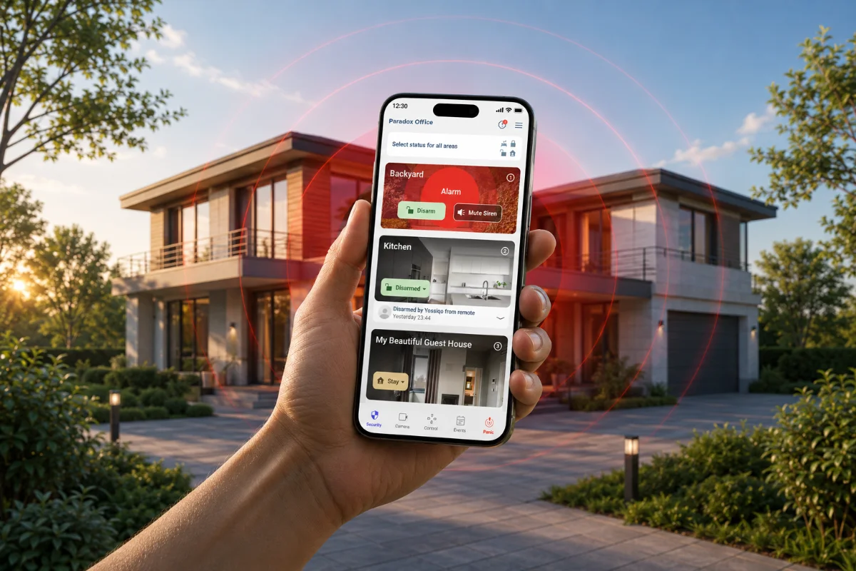
Modernizing the app around a new wireless system.
The existing app was outdated, and the main security actions carried too much friction and uncertainty. As the product moved toward a new wireless system, the experience also needed to move forward, visually and structurally.
This was a chance to rethink how everyday users understand, control, and trust their security system.
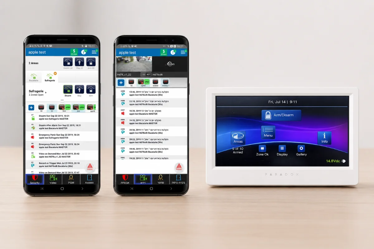
A trusted system that stayed silent.
The hardware was reliable, but the everyday experience left homeowners guessing. Several recurring frictions shaped how people felt about their own security:
Unclear System State
Beeps and small LEDs forced people to interpret their security status instead of simply seeing it. Most never felt fully certain the system was armed.
Fear of False Alarms
Uncertainty about open zones and arming modes made people hesitant. A single wrong action could trigger a siren, a call, or an unnecessary dispatch.
Hidden Information
Cameras, sensors, history, and notifications lived in separate places, or nowhere at all. There was no single place to see the whole home.
Hard to Learn
Codes, partitions, and zone numbers came from an installer's mental model: a professional language end users never signed up for.
Low Everyday Engagement
Because the system was hard to read, people used it for the bare minimum. They armed at night, disarmed in the morning, and ignored everything else it offered.
Make home security something people understand at a glance.
The challenge wasn't to add features. It was to make an entire security system legible and trustworthy in the hands of someone who isn't a professional.
Every state had to be instantly understandable without a manual: armed, disarmed, a zone left open, an alarm in progress. People needed to feel in control of their home, not managed by it.
And it had to stay reassuring in the one moment that matters most: when something is actually wrong.
Designing for trust, not for control panels.
I led the team through the homeowner's mental model of their own home, not the installer's. We mapped the few moments people actually care about: leaving, coming home, checking in, and reacting when something happens.
Every screen was measured against how a non-technical person would read it: often in a hurry, sometimes under stress.
For the homeowner, I kept coming back to three questions:
What gives people genuine confidence in their security?
What can be made calmer and clearer for everyday life?
What installer-level complexity should never reach the homeowner?
A first attempt at a calmer home view.
The first iteration focused on giving homeowners a single, readable home screen: one clear status, the rooms they care about, and the few actions they use every day.
It was an early attempt to translate a professional security system into something a homeowner could actually own.
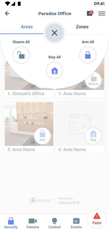
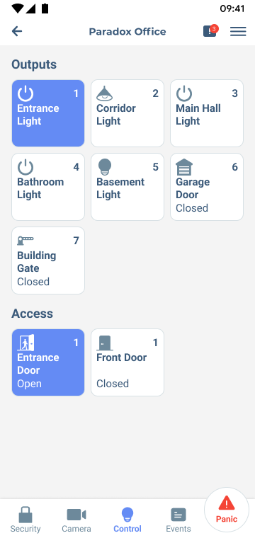
One status, impossible to misread.
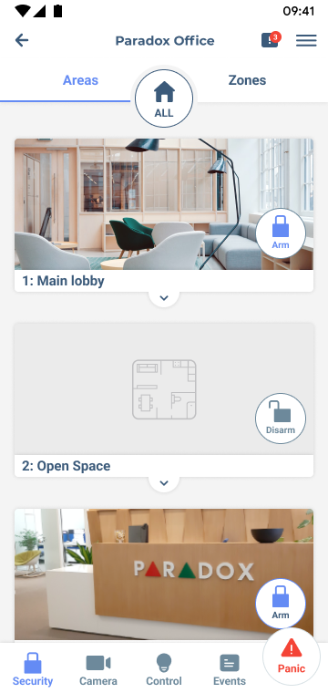
We collapsed armed, disarmed, partially armed, and alarm into a single dominant status that fills the screen: color, label, and motion working together so the system's state is understood in under a second.
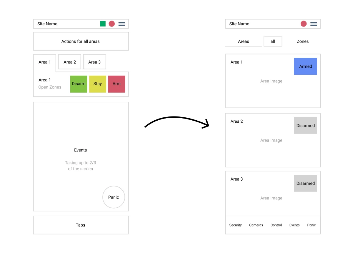
Removing everything that wasn't reassurance.
Zone numbers, partitions, and technical labels were pushed below the surface. The first screen kept only what a homeowner needs to feel safe, with everything else one tap away.
Once the first version reached real homes, the feedback came quickly, and it was remarkably consistent. Across support tickets and beta groups, users kept returning to the same theme: the interface had become cleaner, but it had quietly dropped the cues they instinctively relied on. A few voices stood out.
"I can never tell whether Arm is the current state or the button that changes it. Just show me Armed or Disarmed — and only reveal the Arm / Disarm actions once I tap the control. The old padlock said it best: closed when armed, open when off."
DDaniel · Homeowner"Bring back the colour language. Armed should read red, disarmed green — the way it used to. The old app told me the state before I'd even read a single word."
MMaya · Long-time user"I'd love each area to be colour-coded, so I can identify its status at a single glance the moment the app opens — without reading every line."
RRoy · Small business owner"Could the alarm icons clearly show on or off? For those of us with low vision, the subtle states are hard to read — a strong, unmistakable indicator would mean a lot."
EEsther · Accessibility feedbackRefining clarity into confidence.
After testing the first version, we learned that "simple" wasn't enough. People also needed the system to feel familiar, and to slow them down at the right moments.
The second iteration brought back meaning and added deliberate, protective friction.
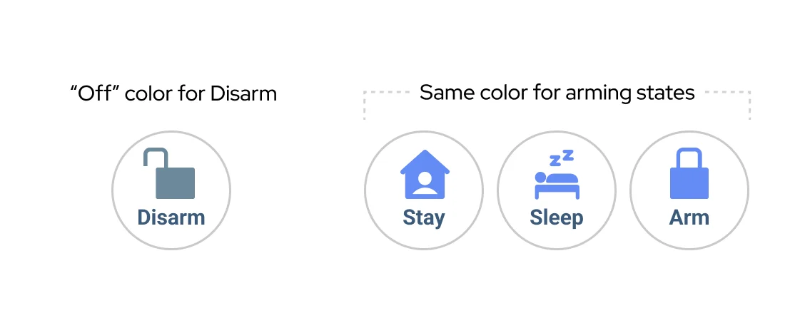
Color people already trust.
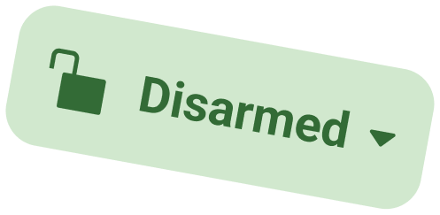
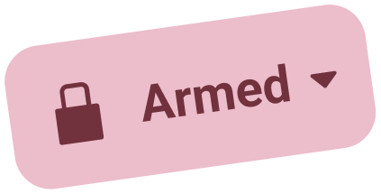
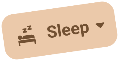
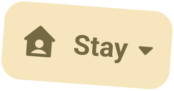
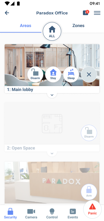
The second issue users raised was telling apart the system's current state from the action that would change it. The original circular control couldn't hold a clear label, so its meaning stayed ambiguous. We replaced it with an explicit status: Armed, Disarmed, Sleep, Stay, paired with a small, secondary "change" affordance, so the state is always readable at a glance and switching it is a deliberate, separate step.
Clarity in the moments that matter most.
The moment someone enters the property, BlueEye sends an immediate push notification that the entry delay has begun, so a returning resident instantly knows the system recognized them, and any unexpected entry surfaces the second it happens. If it isn't you, it's a clear signal that something needs attention.
If an alarm is triggered, the screen offers two deliberate paths: Disarm or Mute Siren. We introduced Mute Siren after close conversations with clients. Many were woken by the alarm at night and instinctively wanted to silence it first, then calmly verify whether there was a real intrusion, rather than being forced to disarm blindly just to stop the noise.
Connecting security, cameras, and daily control.
BlueEye was not designed as a collection of separate features. The goal was to create one connected experience where security, cameras, rooms, devices, and scenarios could work together.
This changed the product from a classic alarm app into a broader smart home control layer.
The challenge was to keep each part simple on its own, while making the connections between them feel natural.
Rooms made the system feel like a home, not a technical alarm structure.
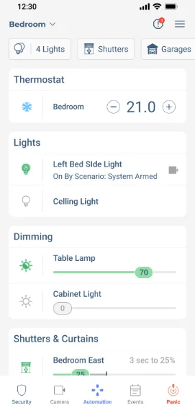
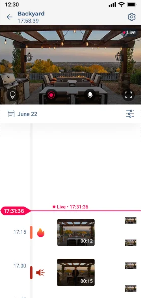
Cameras added visual context to security events.
Timeline turned system activity into a story users could understand.
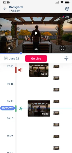
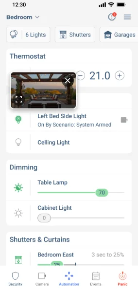
Connected previews helped users act with more confidence.
Scenarios connected security states with everyday smart home actions.
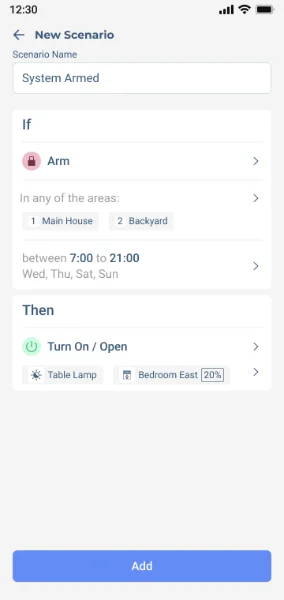
Finding the right interaction model for connected home controls.
Together with the design team, we explored multiple directions for cameras, timelines, shutters, lights, dimming, and climate controls.
These iterations helped us understand how each control should behave on its own, and how it should fit into a larger system where security, cameras, and smart home actions are connected.
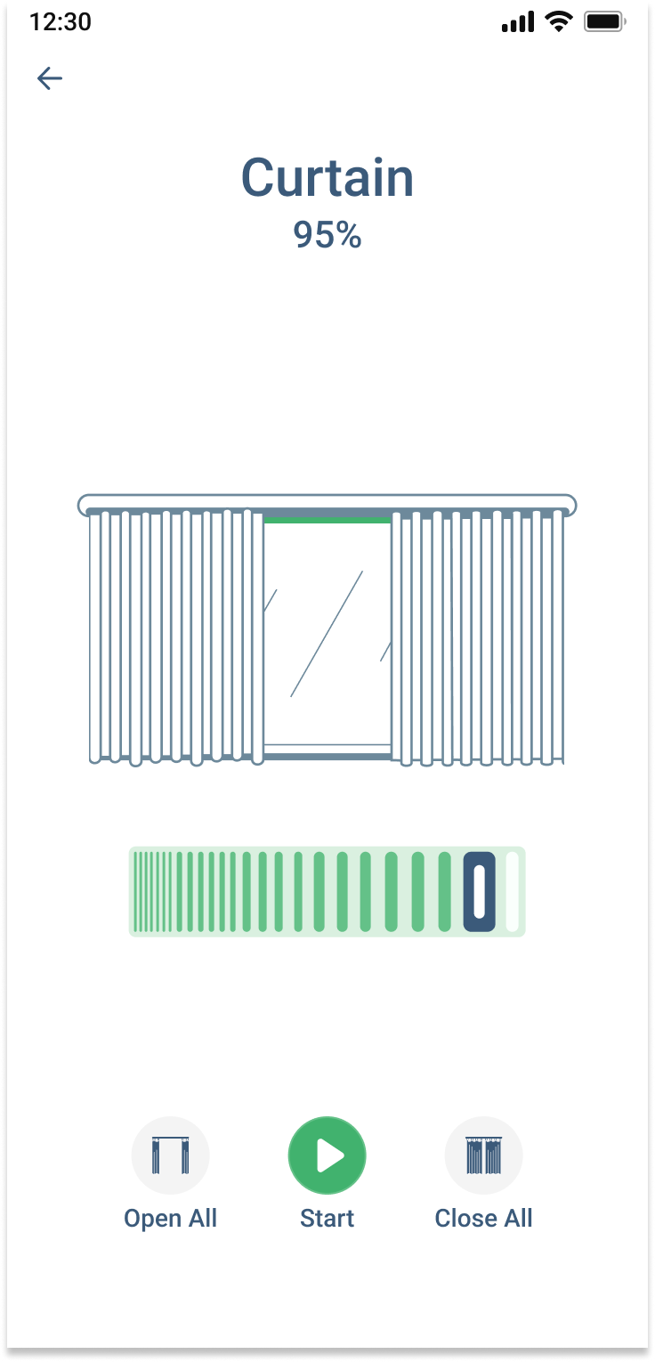
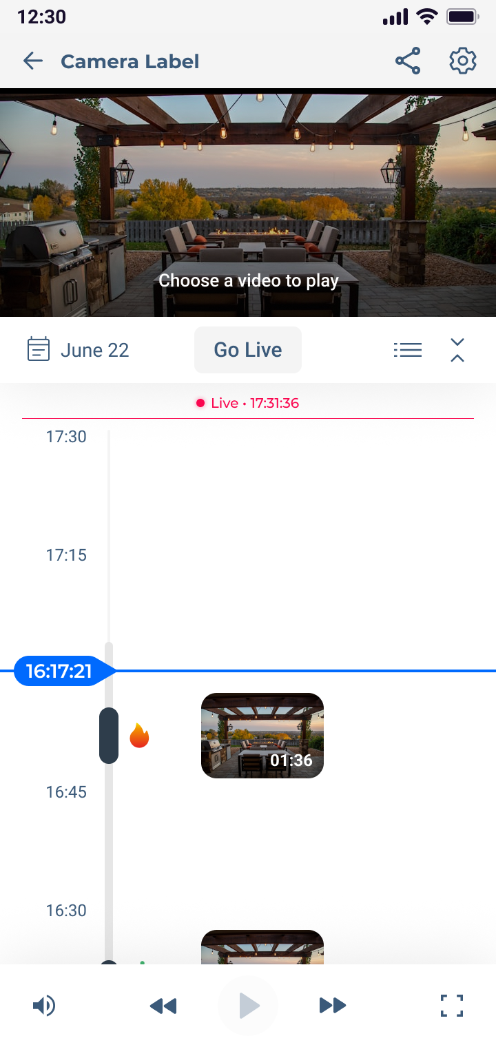
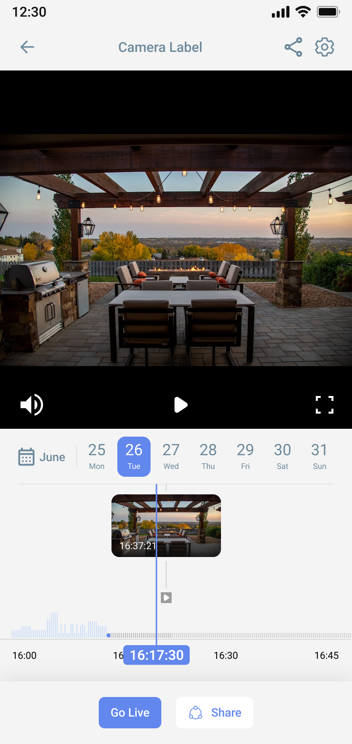
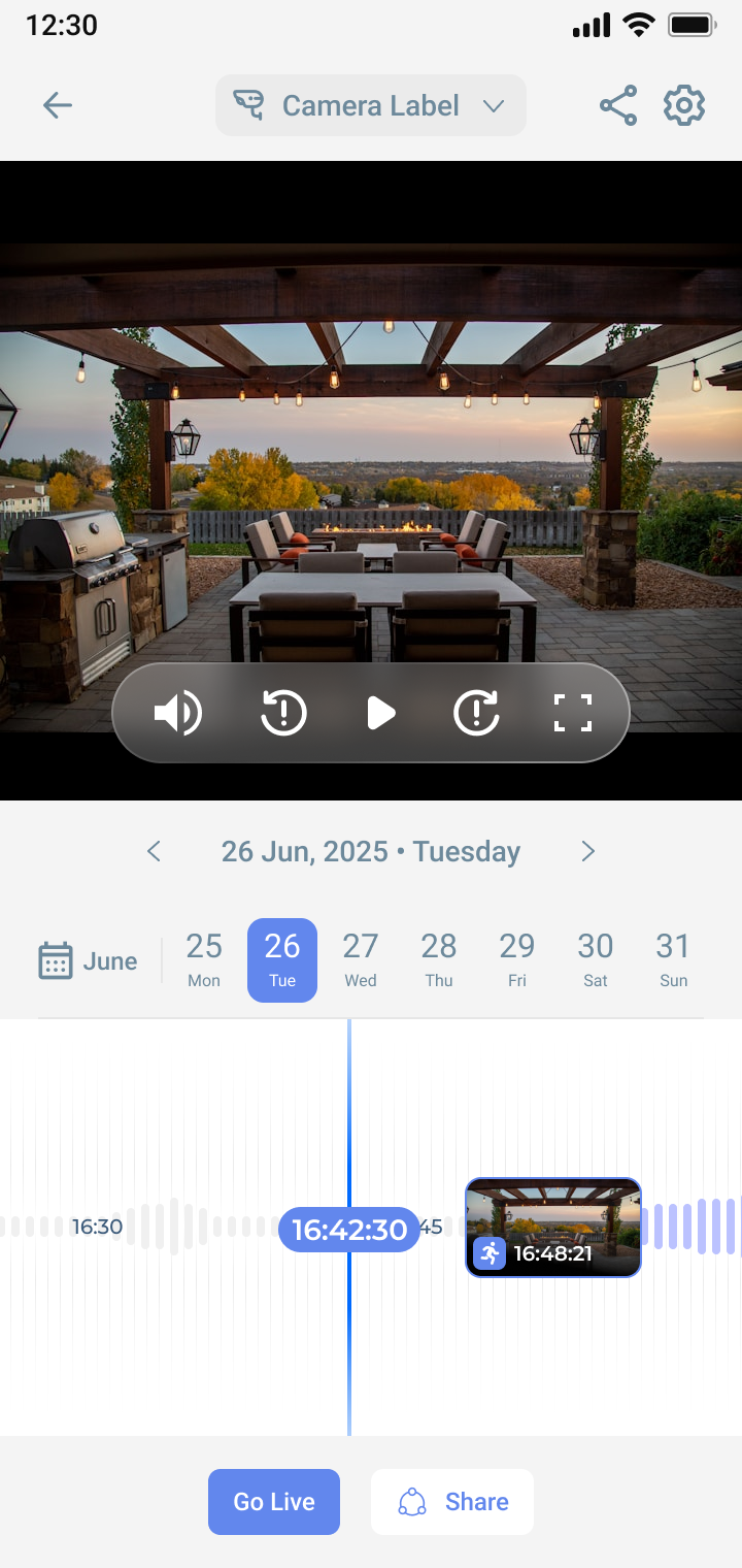
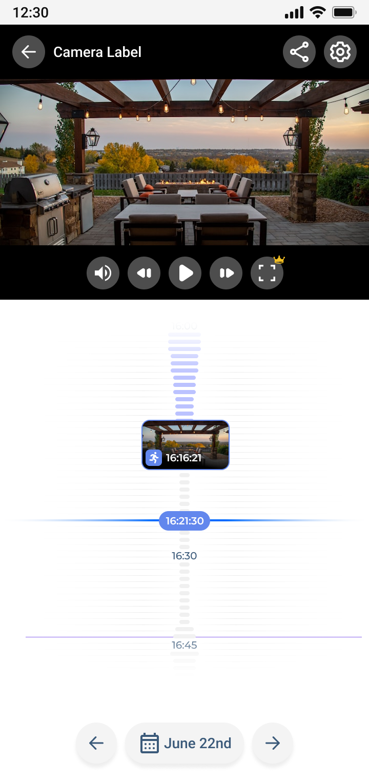
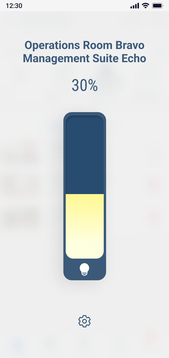
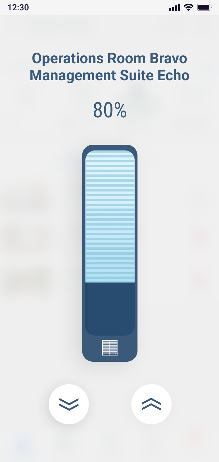
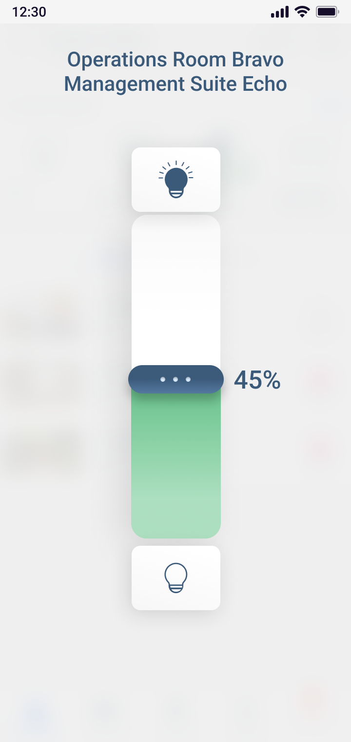
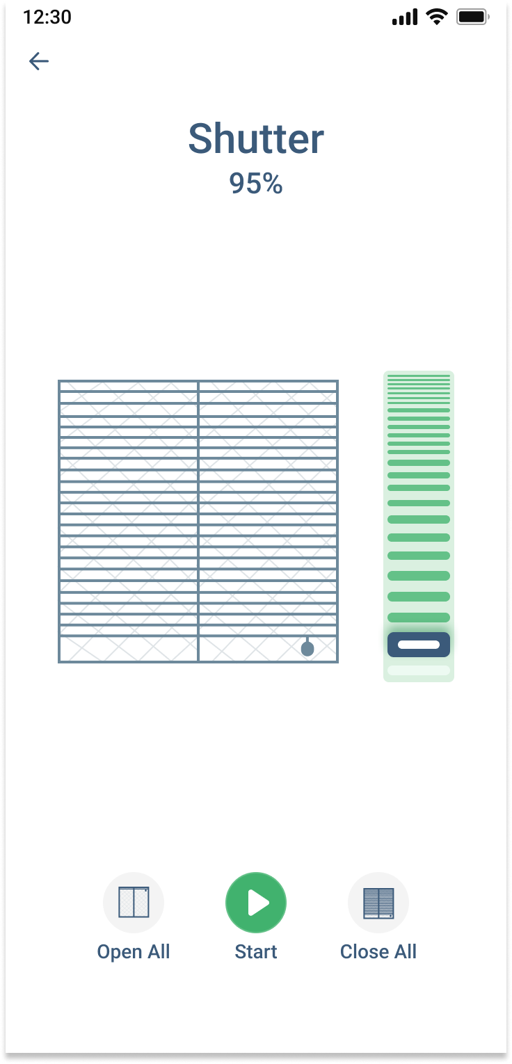
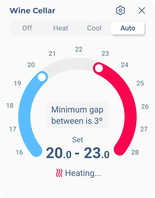
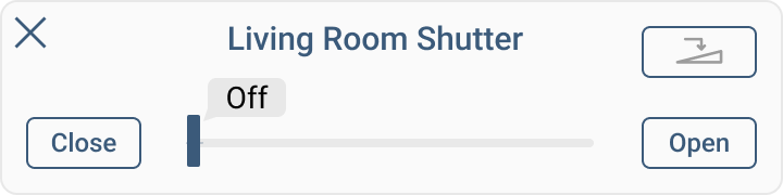
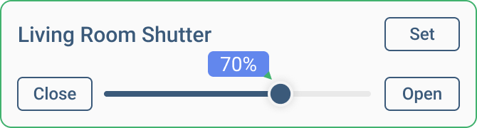
Multiple design explorations helped us evaluate interaction patterns before committing to the final connected home experience.
Security that finally explains itself.
The final experience turned a silent, code-driven system into an app homeowners could read at a glance.
People could understand their home's status at a glance, arm and disarm with confidence, see their cameras and history, and react clearly the moment something happened.
Instant, unmistakable system status
A single dominant state meant people always knew, without a second thought, whether their home was protected, without decoding beeps or lights.
Fewer accidental alarms
Intentional friction on critical actions sharply reduced false triggers and unnecessary dispatches, giving people more peace of mind.
Higher everyday engagement
Because the system was finally legible, people explored cameras, automations, and history instead of ignoring them.
Greater sense of safety and control
Homeowners reported feeling calmer and more in control of their home, especially in the moments that matter most.
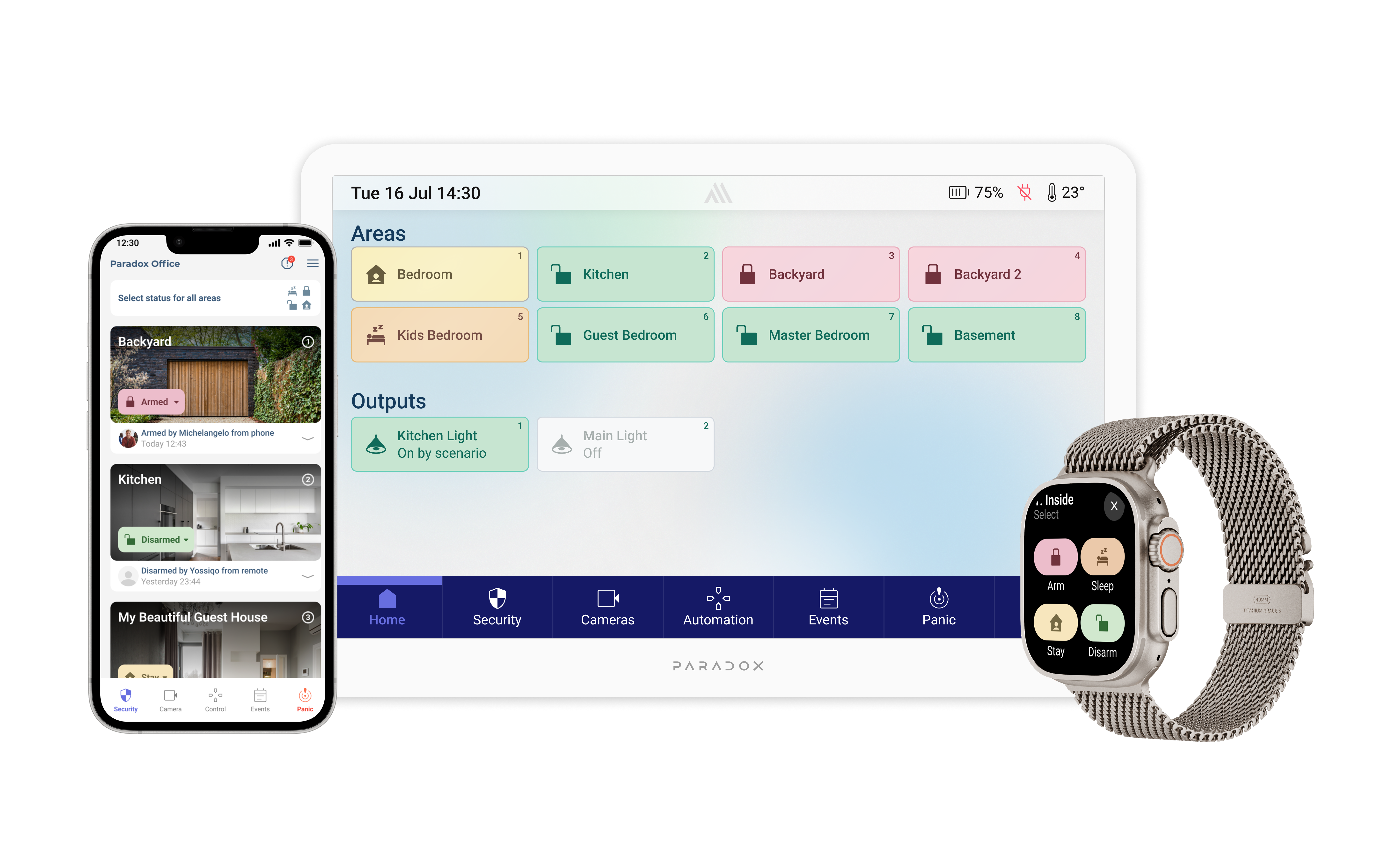
From phone to wall keypad and Apple Watch.
We carried the same experience beyond the phone, extending BlueEye to a dedicated wall keypad and the Apple Watch, so every household member could check status and act from whichever surface was closest.

Want to hear more?
Behind these screens are years of research, trade-offs, and decisions I couldn’t fit on one page. If you’d like to hear how it came together, I’m always happy to talk.
Contact via WhatsApp